
What We Know and Don’t Know After 100 Days of Covid-19 Analytics
What We Know and Don’t Know After 100 Days of Covid-19 Analytics
Reviewing the impact of the virus on the US economy and the American psyche
(Originally published July 13, 2020 in National Defense Industrial Association’s “NTSA Connect”) Full Report
After more than 100 days of Covid-19 analytics, it seemed time to integrate Lone Star’s assessments and analysis. From our first report and webinar before government lock downs were mandated, through this writing, some trends and risks have become clear, with policy and strategy implications for organizations of all sizes.
Background and Summary
In February, Lone Star’s journey with Covid-19 began as it had in past epidemics; supporting others. We’ve previously done invited peer reviews for epidemic and contagion simulations, and similar pro bono assistance. By early March as concerns grew, we were being asked to provide speakers and public facing analytics. Our broad theme has been that, for most people, your 401(k) is likely to be sicker than you are. We’ve published and presented about a dozen pieces. Looking across them, an intriguing feature of the contagion is this: perspective is shaped by where you live, what you do, and how well off you are.
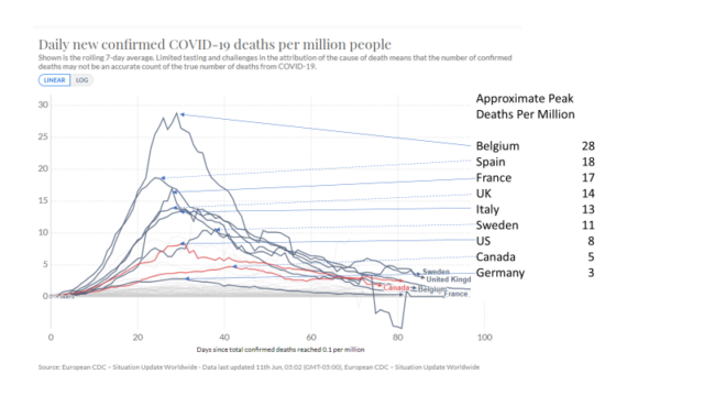
Looking at differences is a way to understand what we know, and what we don’t. For example, the UK, US, and Germany might seem similar. But in the chart, we see quite different death tolls.
The risk of dying in Belgium seems about 10 times higher than Germany. Why the difference? One obvious reason is Belgium counts differently, but that doesn’t fully explain a 10x change in death rate.
You might wonder why Spain has a negative peak of negative 5 deaths per day. In late May, Spain revised how they counted, and removed some deaths attributed to Covid-19. Spain is not alone in changing methods as the epidemic progressed. So, a second lesson of coronavirus analytics is, “you can’t read the other guy’s numbers” which suggests humility in our efforts to understand.
Of course, that assumes numbers exist. A nation-by-nation assessment suggests that only about 10% of the world’s population is being reported with accuracy that approaches “ok.” About a third of the world is generating data which is marginally useful. Over 40% is generating data which is useless, or even intentionally deceptive.